UX Design
Identifying gaps in healthcare
about
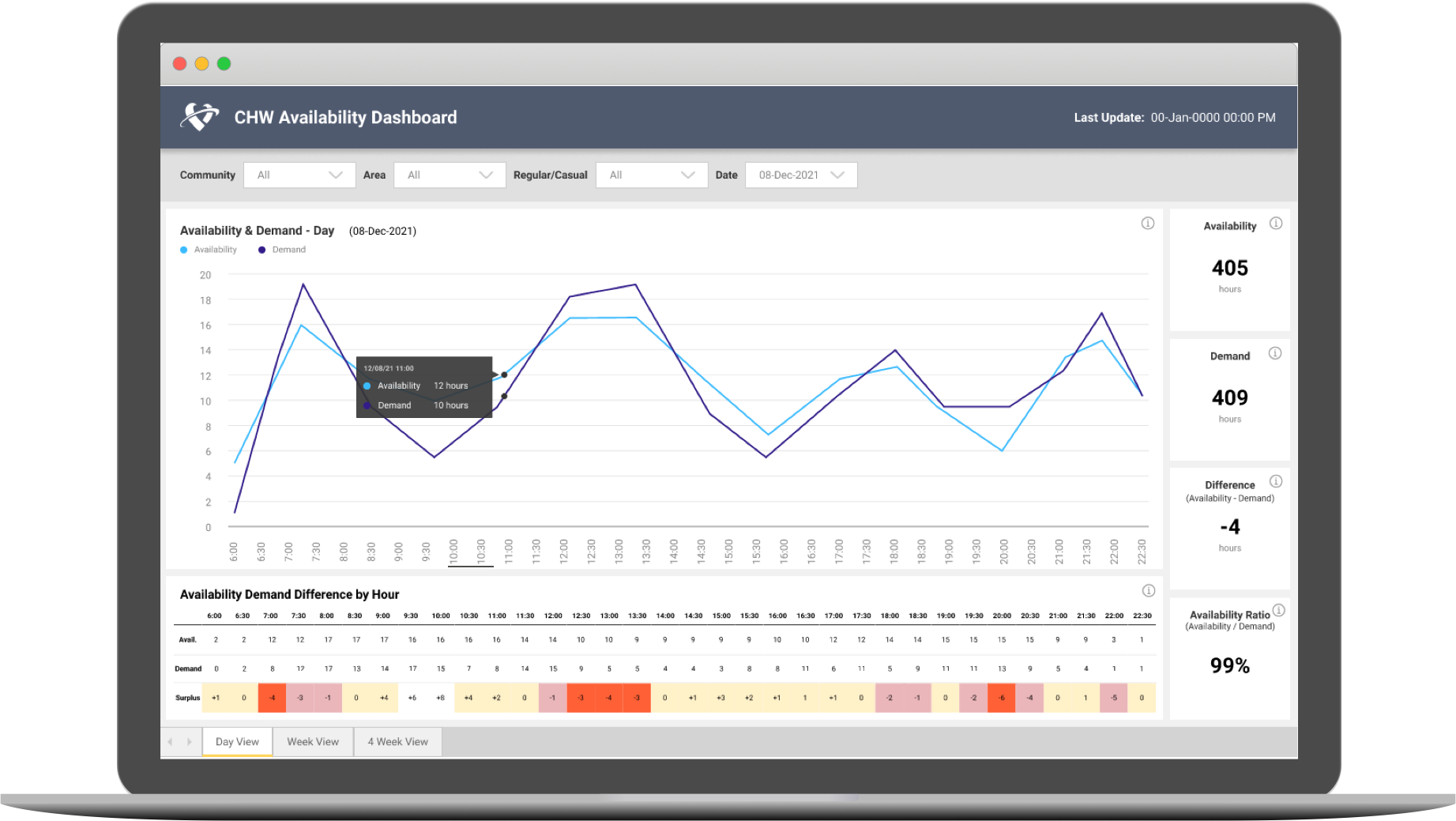
We designed a dashboard that allowed Fraser Health to identify capacity gaps across specific time periods. Different views allow for unique ways of drilling into the data to analyze trends and communities.
role
UX Designer
context
Healthcare dashboard
Team: 2 UX Designers, PM, 2 Data Analysts
timeline
4 Months
(2021 Nov - 2022 Feb)
methods
Stakeholder Interviews
Competitive Analysis
Affinity Mapping
Value Proposition Canvas
Low-Fi/Mid-Fi Wireframes
High-Fi Prototypes
PowerBI
CHALLENGE
Balancing availability with demand
Background Context
The Home Support team is in charge of balancing the availability of Community Healthcare Workers (CHW) against the demand of services required at any given time. With widespread staffing shortages across the sector, identifying gaps in services is important to proper allocation of resources.
Problem
Anecdotally, the team knew there were gaps between the availability and demand, but had no data to back it up. There was an ad-hoc report that gathered the relevant data sources, but it was a manual and time-consuming process to generate.
Home Support needed a way to reliably identify capacity gaps so that they can make decisions regarding real-time scheduling and hiring, as well as conduct strategic long-term planning.
DESIGN PROCESS
Extracting value from research
Stakeholder Interviews
In order to get a better understanding of how the dashboard will be used, we conducted separate stakeholder interviews with directors, data experts, and business analysts familiar with the generated ad-hoc reports. This group of stakeholders also comprised of the primary users for this dashboard.
Interview Goals:
- Learn about their current context and workflow
- Identify areas of friction in regards to planning around availability and demand of CHWs
- Understand the type of questions they hope the dashboard will help answer
- Determine how the dashboard will support their work from both an operational and long-term planning perspective
Insights discovered:
- The biggest issues the team faced was the lack of data and dealing with staffing shortages.
- Currently data is being manually pulled into reports, but it is a tedious process with many shortcomings, such as being error-prone and not reflecting real-time reporting.
- They already had a sense of what the problems are, and hoped this dashboard will become a source of truth to help validate those assumptions.
- The main goal of this dashboard is to be able to see the trends between availability and demand so that they can take action appropriately.
Competitive Analysis
The original request for this project was just to quickly replicate a similar dashboard that the VCH region uses to report their Availability and Demand. After a debrief with VCH, our team discovered that their dashboard had usability issues and did not fully address their operational goals. We knew we needed to take a longer and more original approach to our design as our users goals may also differ.
Despite the issues, there were still certain design elements that we referenced as inspiration, such as the table heatmap and how they broke down the week into 7 daily line charts. These features allowed for a big picture analysis of trends across the week while still being able to focus on specific service gaps identified.
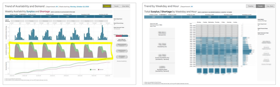
Insights:
If our team had just followed the original ask of copying VCH instead of asking for UX to support with research, we might have ended up in the same situation with a dashboard that didn’t actually address the real needs of our users.
Affinity Mapping
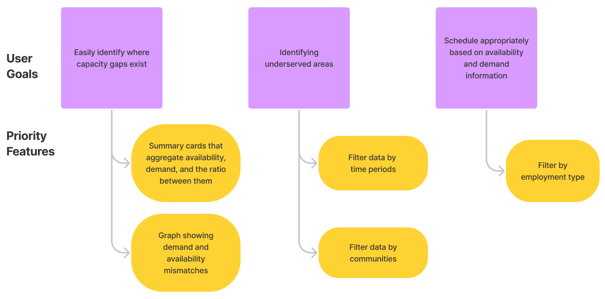
We took the qualitative points gathered from the interviews and organized it onto an Affinity Map to uncover the main objectives and insights. We ended up with a good list of user goals and success metrics that the dashboard should aim for.
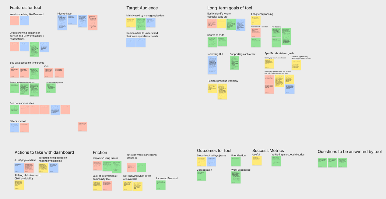
Main user goals:
- Easily identify where capacity gaps exist
- Identify under-served communities and areas
- Schedule appropriately based on availability and demand information
Success Metrics:
- Validate data assumptions using dashboard as the source of truth
- Have evidence to back decisions around recruitment and resource prioritization
- Smoothed out “valleys” and “peaks” in the trends through optimized scheduling
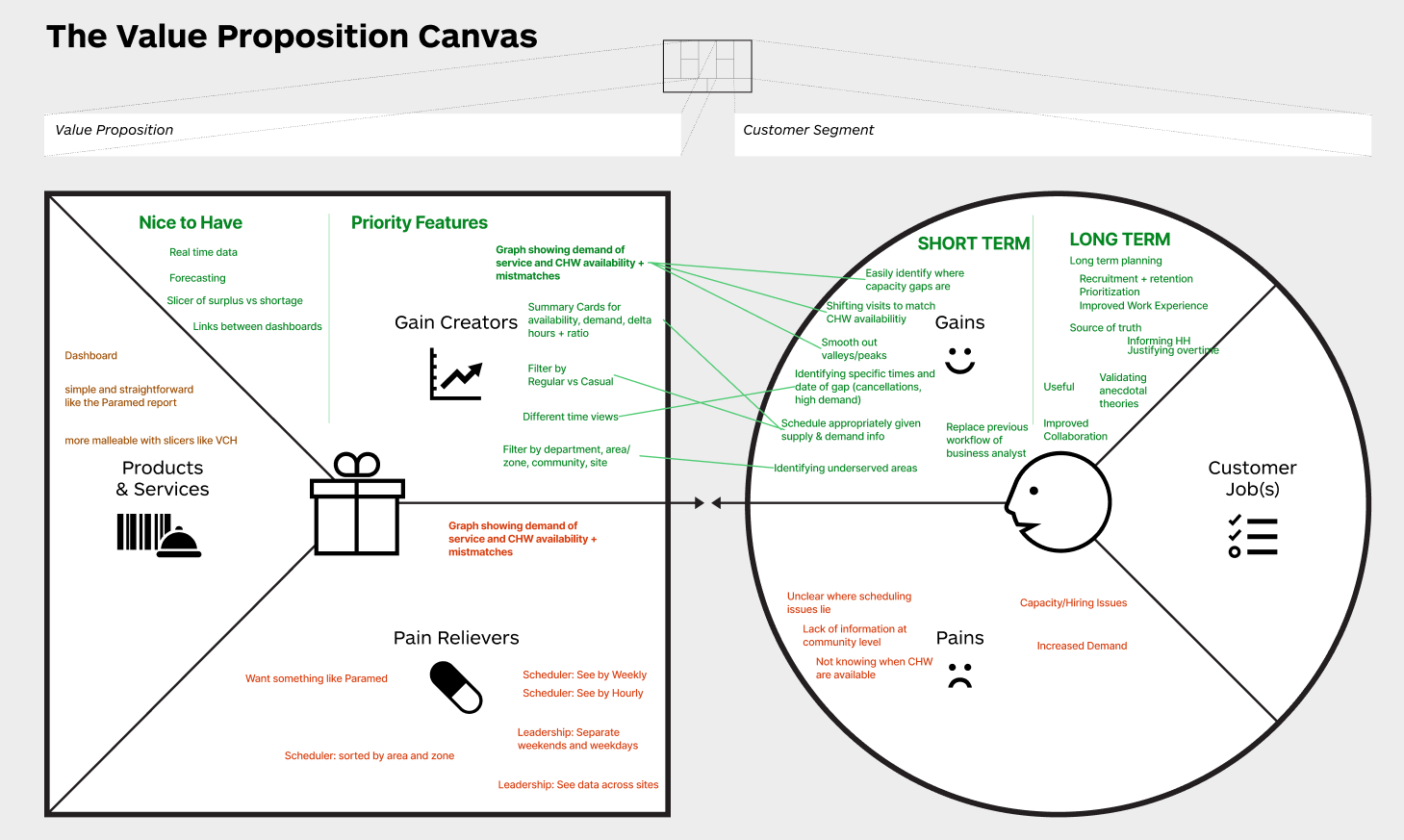
Value Proposition Canvas
In order to design a useful and valuable product for the user, we plotted the features and goals on a Value Proposition Canvas. This exercise allowed us to line up our features with the user goals they are supposed to be addressing. This also helped us prioritize certain must-have features and what are nice-to-haves.
Wireframes
The initial designs were inspired by parts of the competitor dashboard that we found to be useful. They were combined with the priority features identified in our analysis to form the following wireframes.
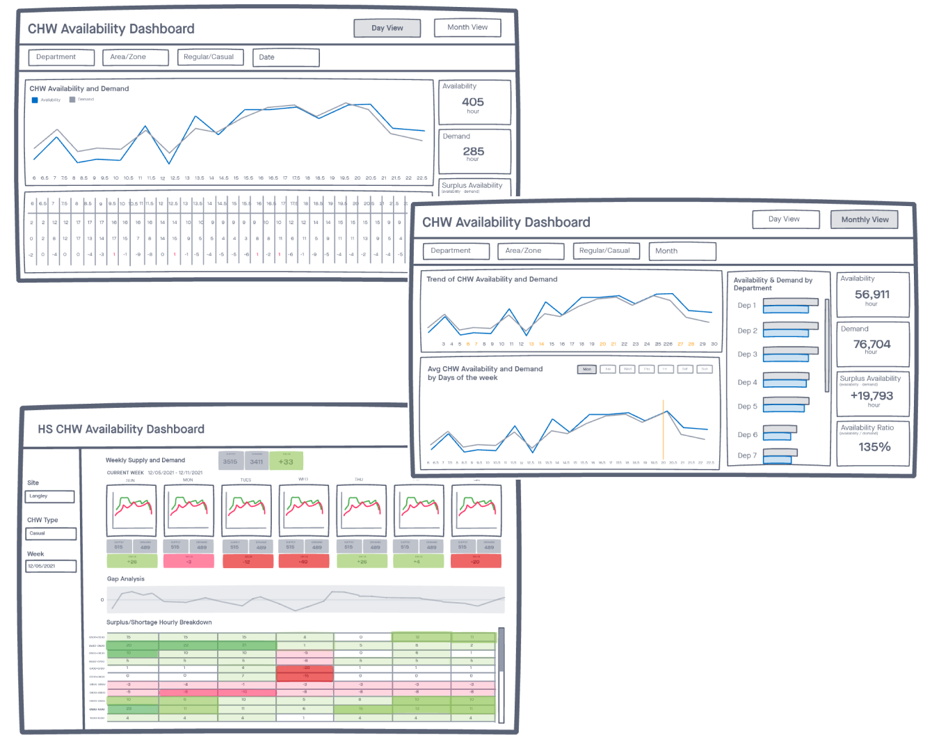
After validating our design with the technical team for feasibility, we polished these rough wireframes into a form that is more presentable to our clients.
We presented all 3 ideas to the clients for feedback, and they thought that each view was useful in different situations, and if we can unify them into one dashboard. They also suggested adding clarification on terminology and definitions so that interpretation of data is clear.
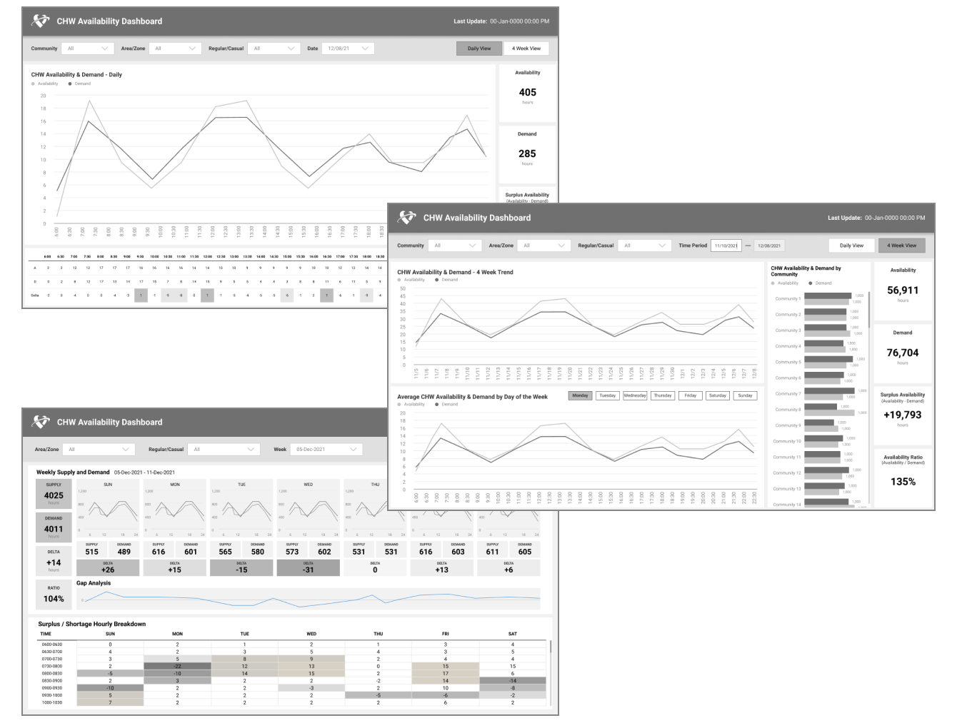
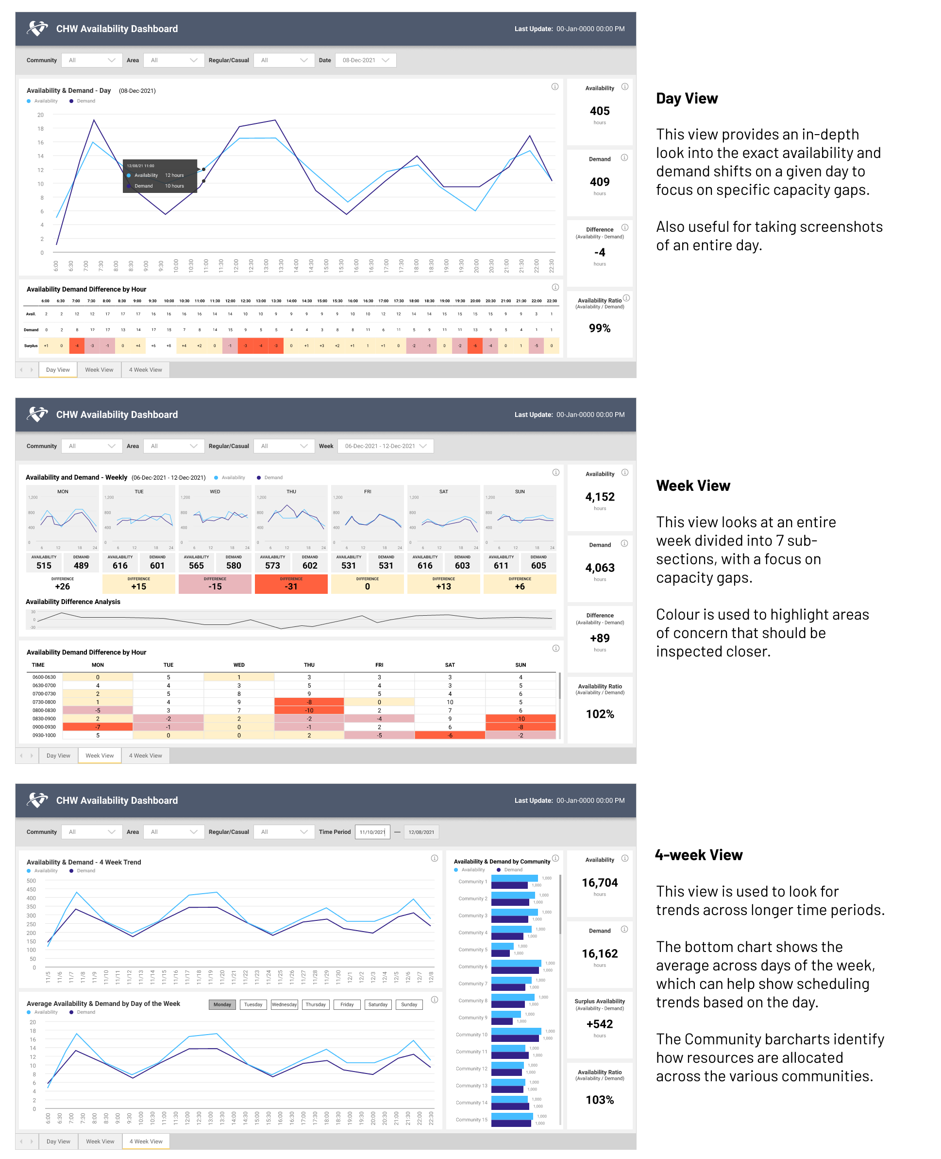
High-Fi Prototypes
With client feedback in hand, we went back and polished up our wireframes into an interactive high-fidelity prototype. The 3 views were rearranged so that they are consistent with the summary cards on the right side. These cards also act as a consistent way to measure performance across time periods.
BUILD
Development and Deployment
Once the final design was approved, our technical team set out to build the dashboard. We took an iterative approach and built one view at a time in order to validate the data with the clients who are more familiar with what they expected to see.
Heated Color Decisions
We paid special attention to ensure the colours we chose are accessible and meaningful. This involved a few revisions based off of feedback and testing.
Originally we had surplus as orange, because we thought having a surplus was a sign of inefficiency and that a balance of 0 was ideal. However, the clients explained that having a large surplus pool is actually a good thing based on how Availability is defined, so we changed the color scale from red to green.
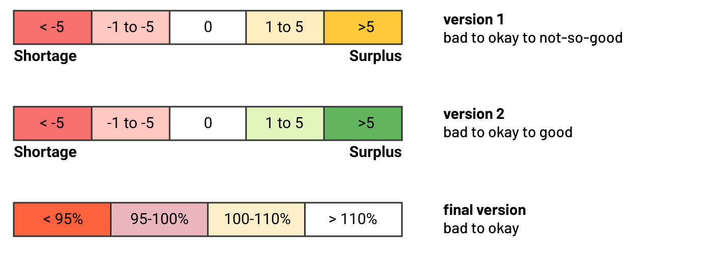
Once we finally had an initial prototype built with real data plugged in, the clients found the green on the heatmap too visually distracting because a majority of the time blocks actually had a surplus (again, a good thing!). We readjusted the heatmap color palette to go from red (warning) to white (everything a-okay) so that attention is focused where it matters.
Unfortunately there isn’t an easy way to prototype data visualizations with real data without actually building the thing. An iterative approach helped us make adjustments once we got a better sense of how the data is shaped and interpreted.
Visual Polish and QA
Although the design was finalized, our job was far from done. In an ideal world, the handoff from design to production is a 1-to-1 pixel perfect replication. Unfortunately, due to scaling differences between platforms, we often end up with a build that is quite far off from the original design.
In order to ensure the final solution is as polished as possible, we went into the build ourselves to make small visual adjustments so that our design is as realized as can be. Ideally this should be completed by the developer but by stepping outside of our roles for a bit, we were able to pick through the intricate details that an untrained eye might overlook.
In the future, we hope that we can improve our Design Library and component templates to account for these differences between platforms, as well as provide tips to help our developers capture the nuances of our design
SOLUTION
CHW Availability Dashboard
Unfortunately, due to the nature of sensitive data, I cannot show images of the final built solution in public. Please contact me if you are interested in a deeper dive into this case study.
Client Reception
While there was some initial hesitancy with taking a longer timeline to include user research, the clients were much happier with the original direction we took and appreciated how we captured their needs and feedback throughout the process. The final design received a lot of noteworthy praise and they are very eager to make use of the dashboard as part of their strategic work.
[This dashboard] is of great value to our regional/strategic work and HR planning. Bravo to the team for their hard work.
- Client
The work is not done yet, however. Ideally we want to push next for some user testing after our users had some time to use it, so that we can evaluate whether the design is actually addressing the goals we have identified.
In Retrospect
Key Takeaways and Reflections
A step in our shoes
For this project, we tried to involve our technical team into our process as much as possible. We invited them to sit in the interviews, and approached them for design feedback to check for feasibility. They will ultimately be building the dashboard, so having them understand the problem space and solution helped ensure we were all aligned.
The reaction we received was quite receptive! They appreciated being included early on and helped provide their insights where appropriate. It opened their eyes to the UX design process and the value it can add to projects. By allowing them to take a step in our shoes, hopefully we can have smoother collaboration in the future.
The ROI of User Research
This project was a really good example of the Return on Investment for user research. If our team had just replicated the existing VCH dashboard like originally asked, we never would have arrived at this solution that better aligns with what our users need.
By taking the initiative to conduct user research, we discovered the why behind the problem and the context of how this dashboard will be used. Our analysis revealed the goals that had to be addressed, and as a result, we were able to design a product that targeted the core needs of our users.
In fact, this dashboard was so well received that it got shown to VCH as a potential upgrade to their current product. Talk about a turn of the tables!
Going forward, the lessons we have learnt from this project clearly outline how dedicating the time to do research can definitely pay dividends it in the long run.
next project