UX Design
Empowering the affordable housing sector
about
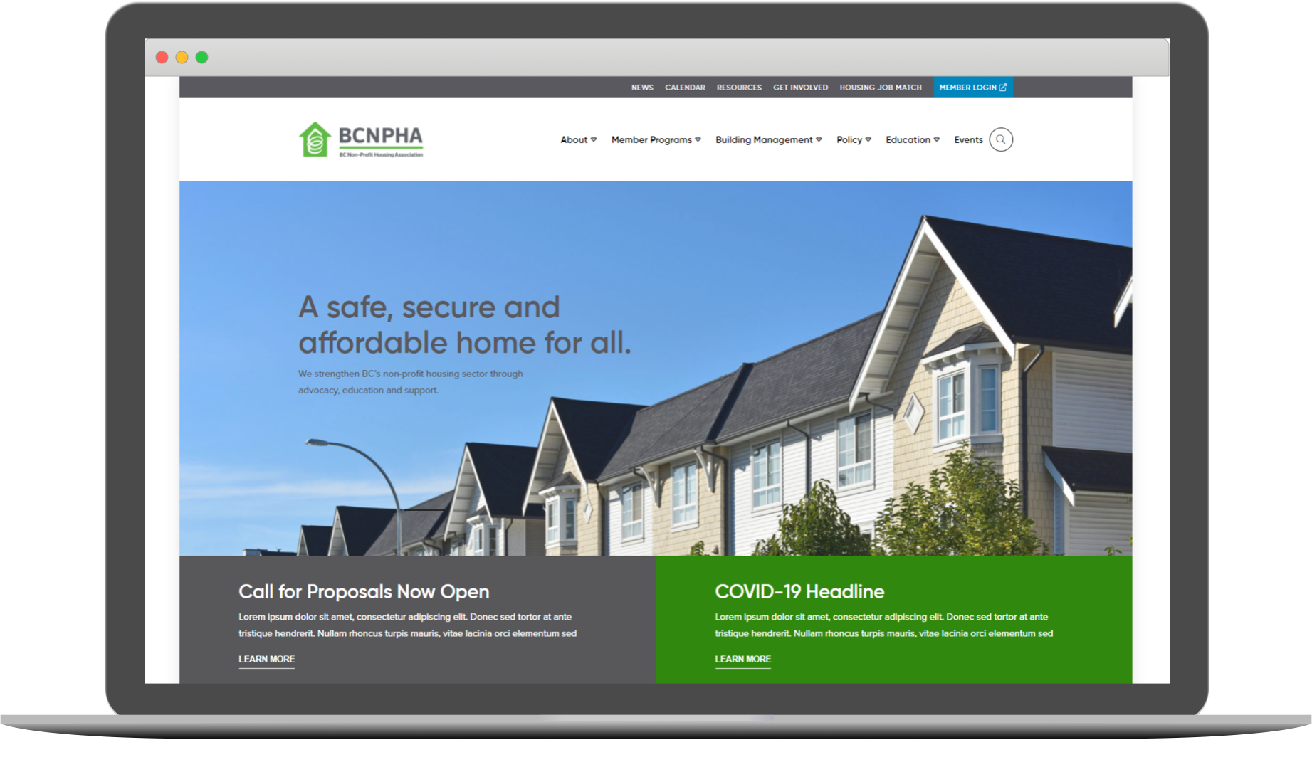
I redesigned BCNPHA’s main website to better serve their members with an improved information architecture that promotes their diverse content and educational offerings. You can visit the website at https://bcnpha.ca/.
role
UX Designer, Design Lead
context
Non-profit website
timeline
7 Months
(2021 Jan - July)
methods
Content Audit
Data Analytics
Stakeholder Interviews
User Survey
Card Sorting
Sitemap
Sketching
Wireframes
PROBLEM
Empowering our members to serve the public
BC Non-Profit Housing Association (BCNPHA) is an association that serves over 500 member organizations in the affordable housing sector. These include non-profit housing societies, partners, businesses, and governments.
They don't directly provide housing, but empower their members who do with support through education opportunities, events, resources, advocacy, and professional training.
The previous website had an outdated design that did a poor job in conveying the breadth of work they did. New visitors had trouble understanding what the organization did, and regular users found it confusing to navigate with commonly accessed resources buried deep in the sitemap. Finally, due to a convoluted backend system, only a few staff knew how to make content updates, causing workflow inefficiencies.
My Role
In this project, I was the solo UX Designer for the team and focused on conducting user research to better understand the user groups and their goals and objectives. We worked with an external web agency that provided support with the UI Design and Web Development aspects. Work that was completed by the agency will be clearly labeled in this case study.
DESIGN PROCESS
Using Data and Research to build a better site
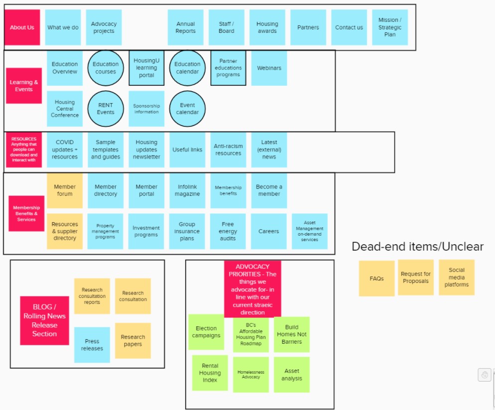
Content Audit
The project started with a full site content audit to get a better sense of the structure of the existing content and what will have to be migrated over.
Insights
I discovered that the site is very content heavy as it is meant to be a resource for many different user groups with varying goals and reasons for visiting. There was no clear CTA in mind other than promoting the latest event or education offering which changes on a weekly basis.
Data Analytics
There was a large amount of data from Google Analytics as well as event registration data from their CMS and email promotions that we were able to look through.
Insights
By correlating data sources together, we discovered that most of the traffic came from newsletter campaigns, with very little organic traffic. Education and Events were the major traffic drivers, and the Resources section was heavily underutilized at <7% of total web traffic despite great efforts being put there.
Stakeholder Interviews
We conducted a series of interviews with department directors and key staff to define the goals and priorities for this site. We also wanted to understand the success metrics to measure against.
Some of the points we discovered were:
Goals:
- Keeping the sector up to date with news and resources
- Providing value and empowering our members with advocacy, education, and support
- Cross-promoting work between department
Success Metrics:
- Increased organic page traffic and time spent on page
- Track and increase member resource downloads and event registration
- Train more staff to maintain and update site content
Insights
Since they already had a strong market share of the non-profit housing sector as members, there wasn't a strong conversion goal to attract new ones; rather, the focus was to provide more value to existing members. There was also an emphasis in trying to present a stronger unified image of our brand and offerings, as members see us as one organization, and not the distinct departments that we are used to thinking about.
We had a general idea of what the stakeholders wanted, but now we had clear goals to keep in mind and a way to measure success.
User Survey
Since the site was used by so many different user groups, we wanted to conduct a wide reaching survey to try and capture this data. The survey asked general questions on why users visited our site and how familiar they are with various offerings.
It was sent out through our mailing list and we received over 300 responses for it. We had to be aware of survey bias as users who were already activated engaged with us were more likely to participate in such a survey.
Survey Discoveries
- Over 85% of participants only visited the site a few times a month or less
- Primary reasons for visiting was to 'Register for education events' and 'Find relevant resources and information'
- Despite the above, only 30% mentioned ever accessing the Resource section before
Insights
Much of the survey insights were backed up by the Analytics data such as the fact that while many claim they want to come find resources, the actual section is lacking in pageviews. One reason could be poor navigation or lack of clarity on what resources we have to offer.
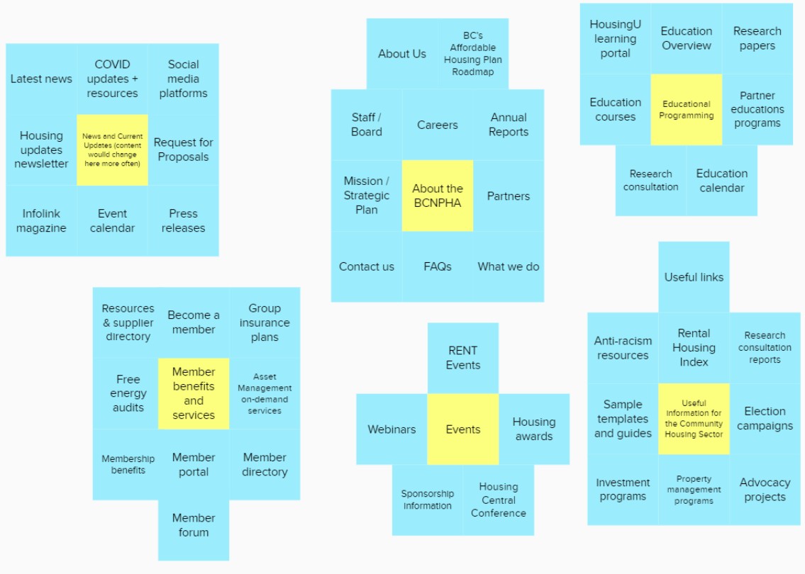
Card Sorting
In order to try and craft a more intuitive information architecture, we conducted a Card Sorting exercise with 8 participants. In these 40 minute sessions, we had them organize our content and offerings into logical groupings that made sense to them. Afterwards, we conducted a semi-structured User Interview to dig deeper into their mental models.
Insights
Users saw our content in different ways based on their role and level of involvement with us. For example, executives were more interested in high-level planning tools while managers wanted professional development opportunities for their team. This exercise also gave us a chance to trim down irrelevant content that didn't belong with our core groupings.
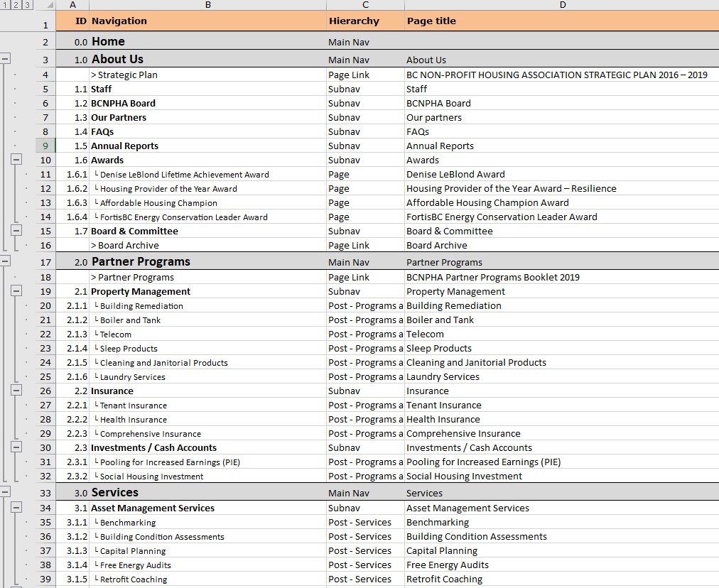
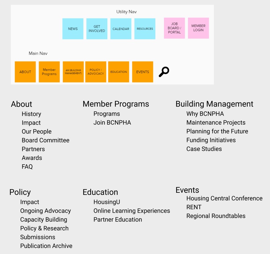
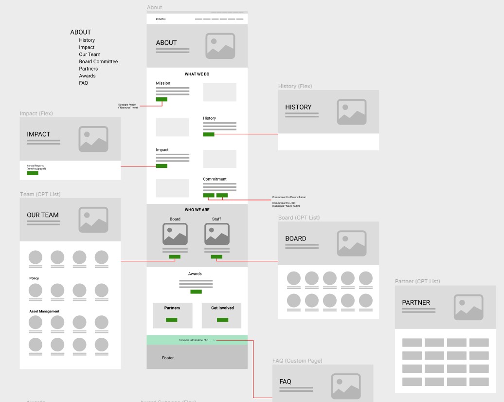
Sitemap
By combining the insights from our research phase, we created this top level sitemap of the website. The Main Navigation breaks down our core offerings into subsections, while the Utility Navigation provides an easy way for users to find the latest news and calendar events.
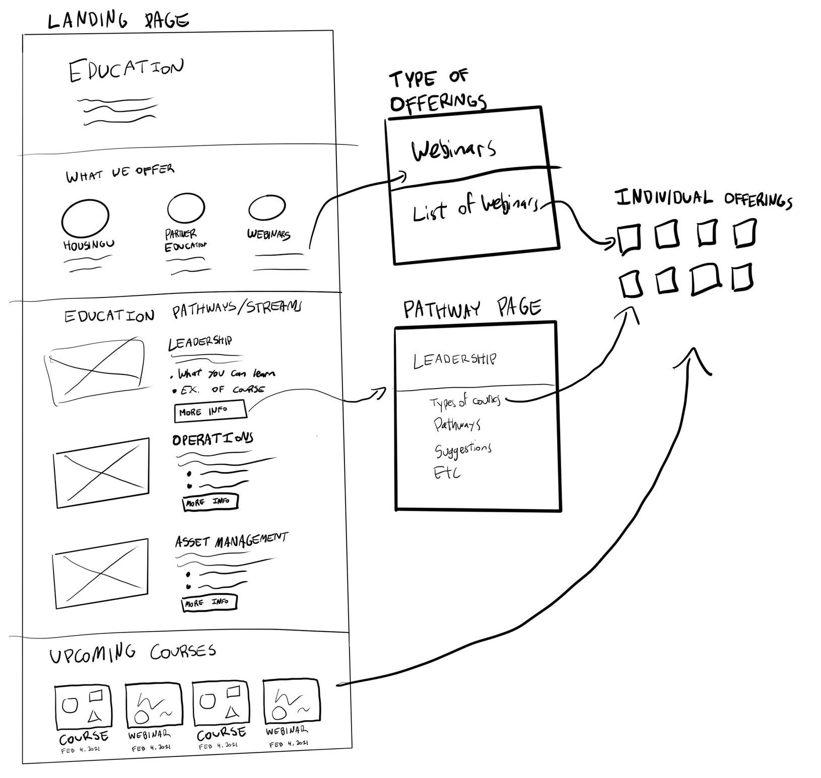
Sketching
Even though the sitemap was ironed out, there were still a lot of details to figure out about how to map various content pieces into each section and how to best organize the subpages. I translated the research insights and stakeholder goals into visual layouts through sketching and explored different ways to lay out complicated sections.
One example was for the Education section that broke up individual offerings into 3 formats, as well as 3 pathways based on occupation role. This supported different mental models of how our users thought about our content from both a categorical and functional perspective.
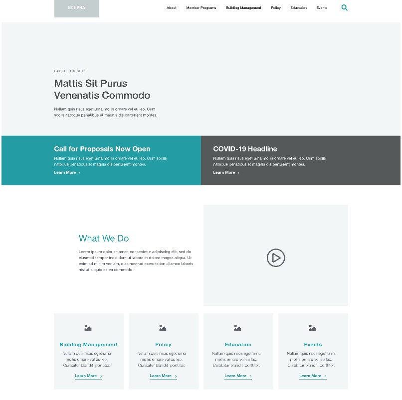
Wireframes
From those rough sketches, I built out low-fidelity content wireframes for every landing page and section. In order to create a flexible system, I designed reusable components for a block based system so that new pages can easily be designed in the future without requiring a strong design sense.
It wasn't fully a design system yet, but this methodology helped us keep the site consistent across sections. There is a good opportunity here to expand this system across the entire brand.
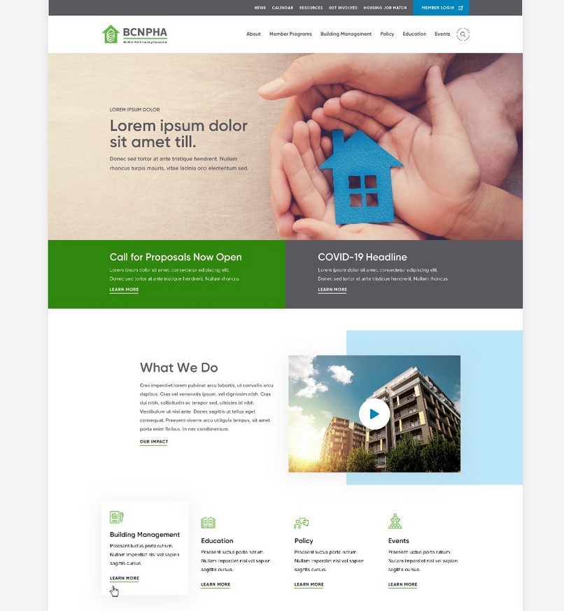
Mid and High Fidelity Mockup Refinements
From here on, I worked with the external web agency to transform these wireframes into mid and high fidelity UI mockups. My role transitioned more into a Design Lead that directed and provided feedback on the visual design direction and style. I also ensured the design was fully responsive and met web accessibility standards.
SOLUTION
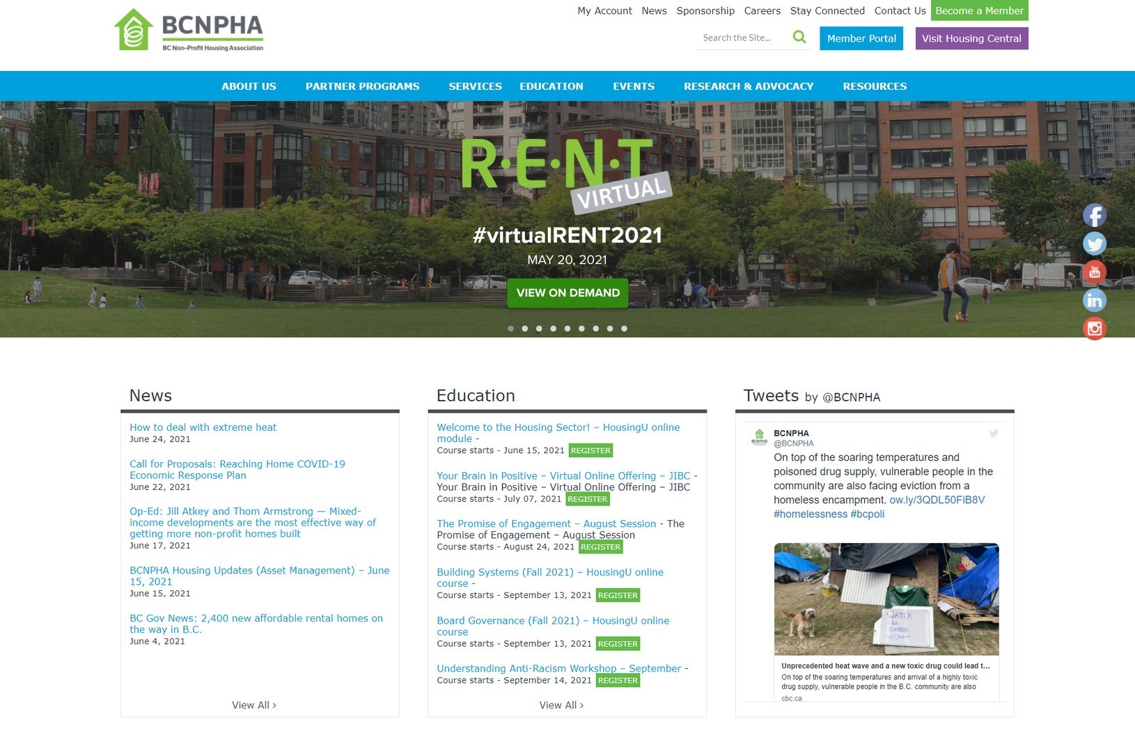
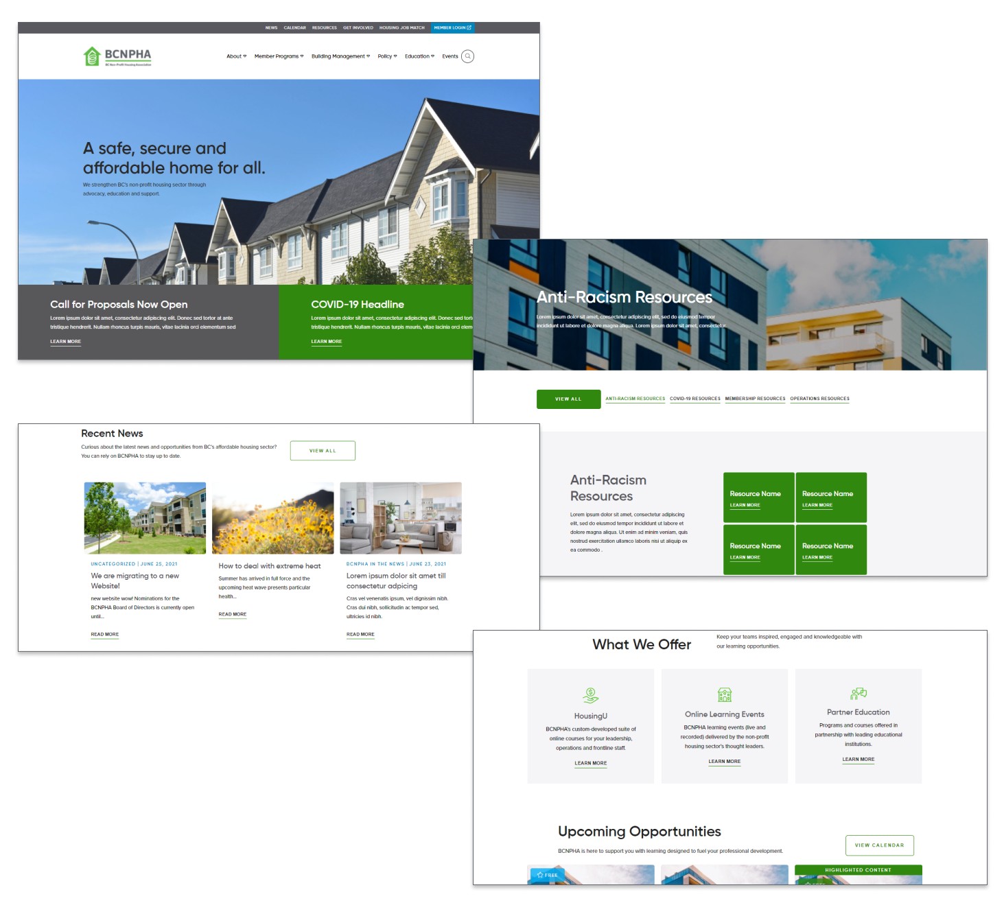
BCNPHA's new website
The website was developed by the web agency's dev team on Wordpress with a flexible component system that allowed for anyone to easily create new pages by dragging blocks in a WYSIWYG editor. They also helped us set up robust analytics tracking to help measure against our success metrics.
My team worked on importing the content over to the new site and ensured that the new navigation structure was fully utilized to cross promote our resources and offerings.
The website can be found here at https://bcnpha.ca/.
In Retrospect
Key Takeaways and Reflections
Balancing stakeholder goals with user goals
While we wanted to make sure every stakeholder had input with the planning and decision making process, sometimes you can't please everyone. There were times we had to adjust their expectations that clashed with user goals such as having a clear and uncluttered site.
Some stakeholders wanted to keep the existing rotating homepage banners to promote content on. Based on design research, we knew that these are ineffective at capturing attention and potentially even annoying. In order to keep a clean and user-friendly site, we created a compromise by having two static boxes that allowed for promotion without intruding into the brand image.
Picking my battles
As the solo designer on the team, I had full reign in deciding how to go about building this website. While I technically had the skills to build the site from scratch myself, I decided it would be better to consult an external team with the expertise to set up a strong foundation that we can build on top of.
This allowed me to focus my efforts on trying to better understand our users and the goals they had. These insights turned out invaluable in the end, as even though the web agency were experts in UI design and dev, they lacked the context and insights to build a proper user-centered site for our members.
In hindsight, I wish I had more time to conduct usability testing with the mid/hi-fidelity mockups in order to validate our design. Unfortunately, when working with an external agency, it's hard to get your timeline and processes aligned to be able to go through the full user-centered process.
next project