Web Design

Promoting research achievements
about
We built a custom web solution for the ixLab to highlight their research and achievements. It was designed to make it easy for the site owners to publish content and news to the world. You can visit the website at https://ixlab.cs.sfu.ca.
role
Web Designer
Web Developer
context
Client Project
(Team of 2 designer/developer)
timeline
4 Months
(2020/01-04)
methods
Stakeholder Interviews
Competitive Analysis
Wireframes
Mid-fidelity Mockups
Craft CMS (HTML/CSS/JS/PHP)
SASS
Git
CHALLENGE
Crafting a maintainable site
The Interactive Experiences Lab (ixLab) is a small but growing research group at Simon Fraser University. Occupied by renowned professors, talented students, and award-winning research, they needed a website that matched the precedent set by their work.
The previous website was difficult to update and they did not have the resources to constantly manage it. Our challenge was to build a web solution that allows the lab to easily maintain their online presence by promoting their research and achievements.
My Role
I collaborated with another designer for this project and we both took part in every aspect of building the website, from design to development. I also set up the server configuration to deploy the website.
DESIGN PROCESS
Discovering insights in research
Stakeholder Interviews
Before we could start ideating, we had to identify what the lab actually wanted in their new website. We also wanted to understand the issues with the previous solution and why it was not working for them.
The previous site had been built as a single-page application by a computer science student who was excited to deploy new web technologies, but did not account for the needs of the people who have to work with the website afterwards. The professors had busy schedules and constant student turnaround made it difficult to assign one person as the webmaster.
From a series of discussions, we figured out the following goals and requirements for the website:
Goals:
- Promote the research themes of the lab and entice prospective students to apply
- Serve as an archive of work for grant and contract applications
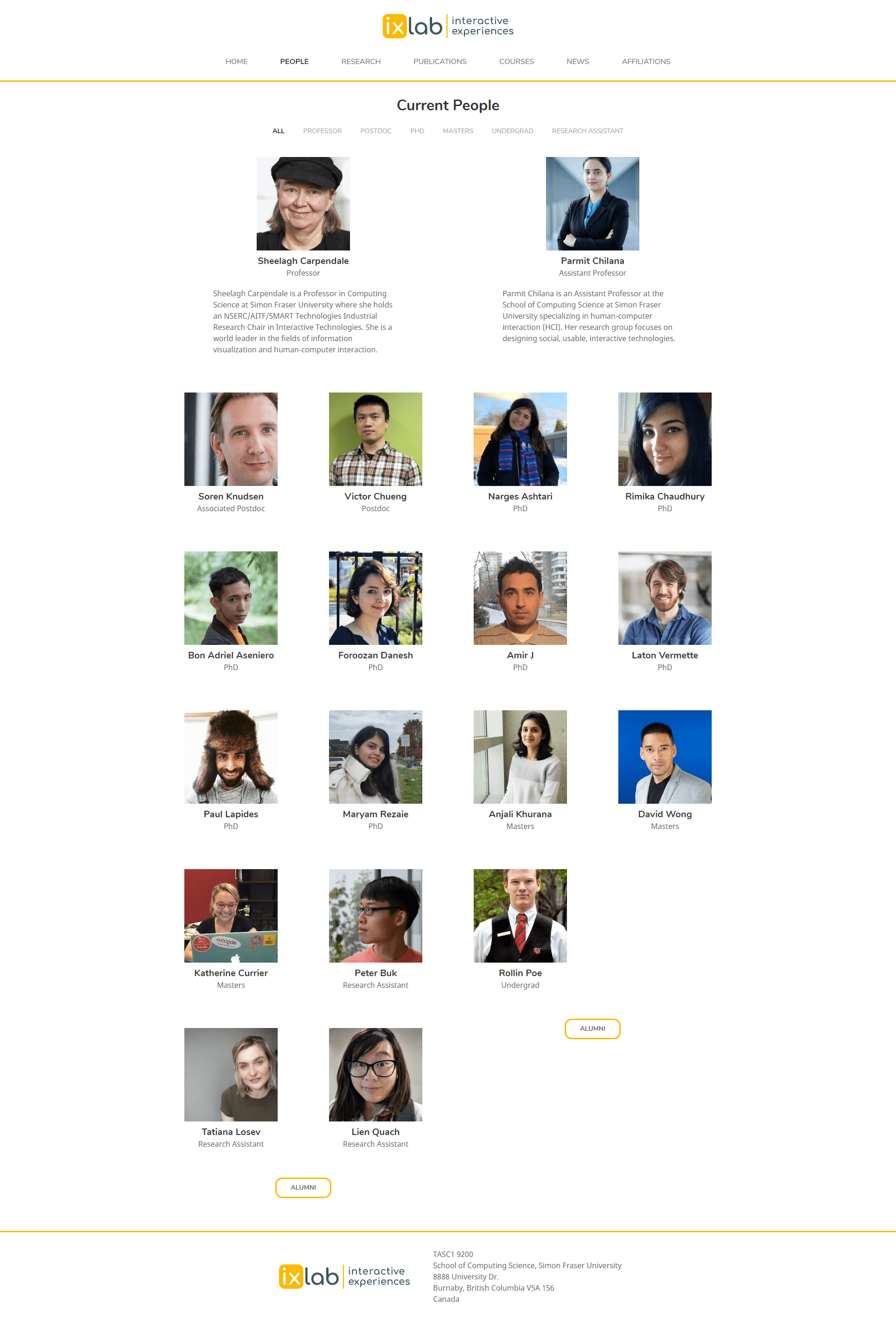
- Highlight the students of the lab, both current and alumni
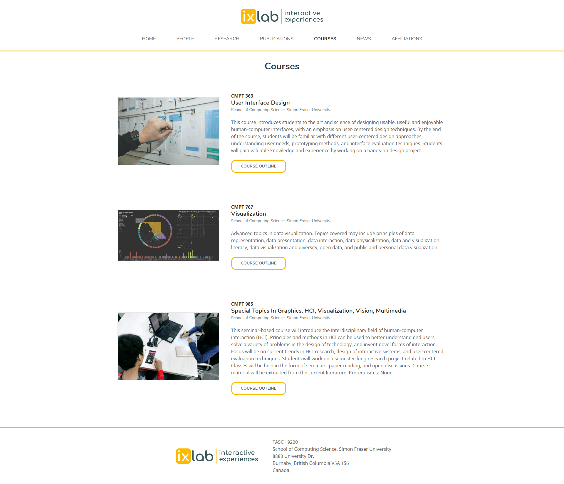
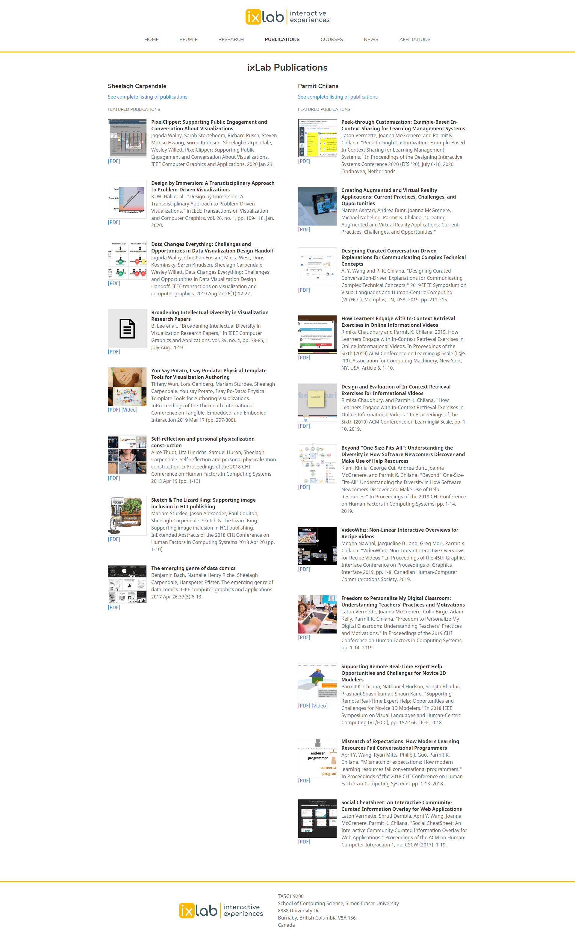
- Curate a list of recent publications and projects
- Share news about the lab with short "tweet-length" announcements
Requirements:
- The lab consists of 2 professors and their respective groups that needed to be visually separated yet appear cohesively together
- One of the professors has many more years' worth of work behind her that will have to be curated to maintain balance
- The website should be easy to update with new content and can be on-boarded to new members of the lab
Insights
The users of a website are not just the visitors, but also the people who have to manage it. The new website needs to have a good workflow for the content managers too. By understand their goals and pain points, we can create a solution that addresses all of those needs.
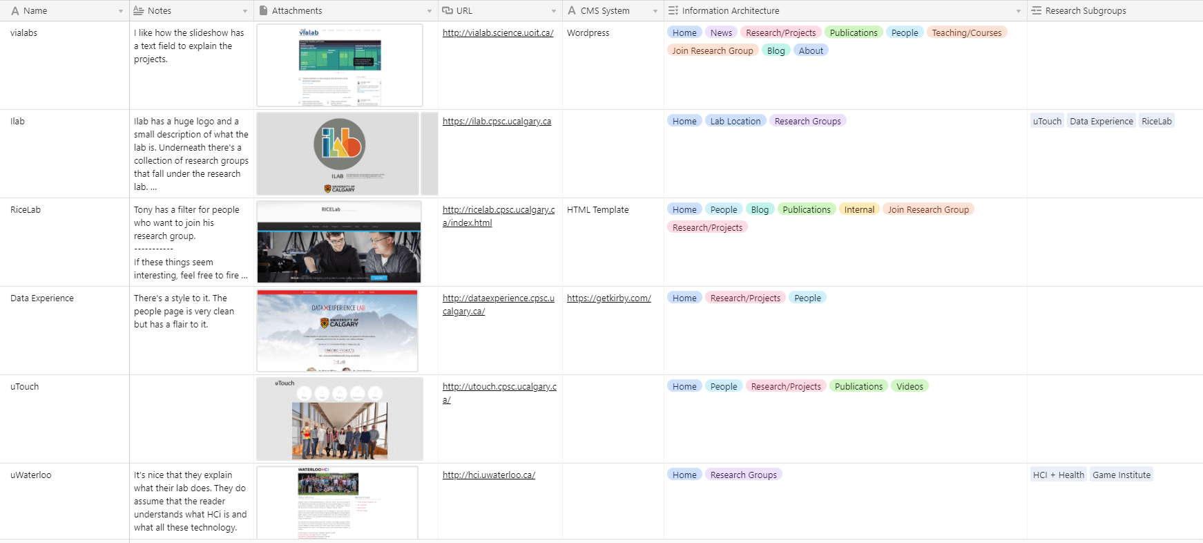
Competitive Analysis
We looked into other research labs to study the common navigation patterns and content hierarchy expected from this type of website. We categorized our research in Airtable and noted down any features that worked well to inform our own designs.
Insights
Most of the sites followed a similar navigation pattern. One place where they varied was the distinction between Projects, Publications, and Research. Some labs considered Research as themes while others classified them as projects. We needed to clearly define which definitions made sense for us and our goals.
Computer Science research websites in particular tend to have more outdated UI designs, with a focus on functionality over aesthetics. There is an opportunity to stand out by going against the norm.
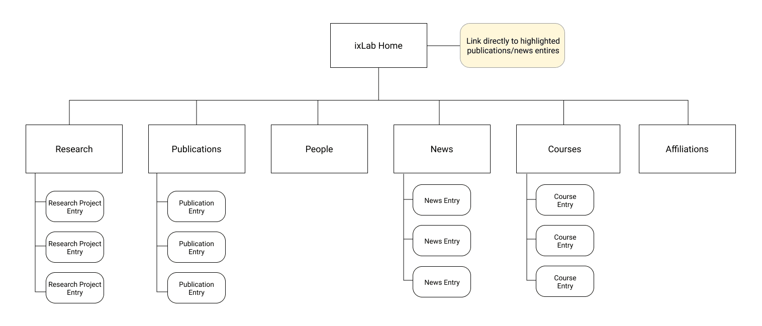
Information Architecture
Informed by our research, we arrived at this sitemap for our top-level navigation. The client also wanted to feature highlights of specific entries on the homepage based on similar designs from other sites.
We decided to define Research as overarching projects that can span across multiple publications and students. This will help promote the type of research being conducted to interested students.
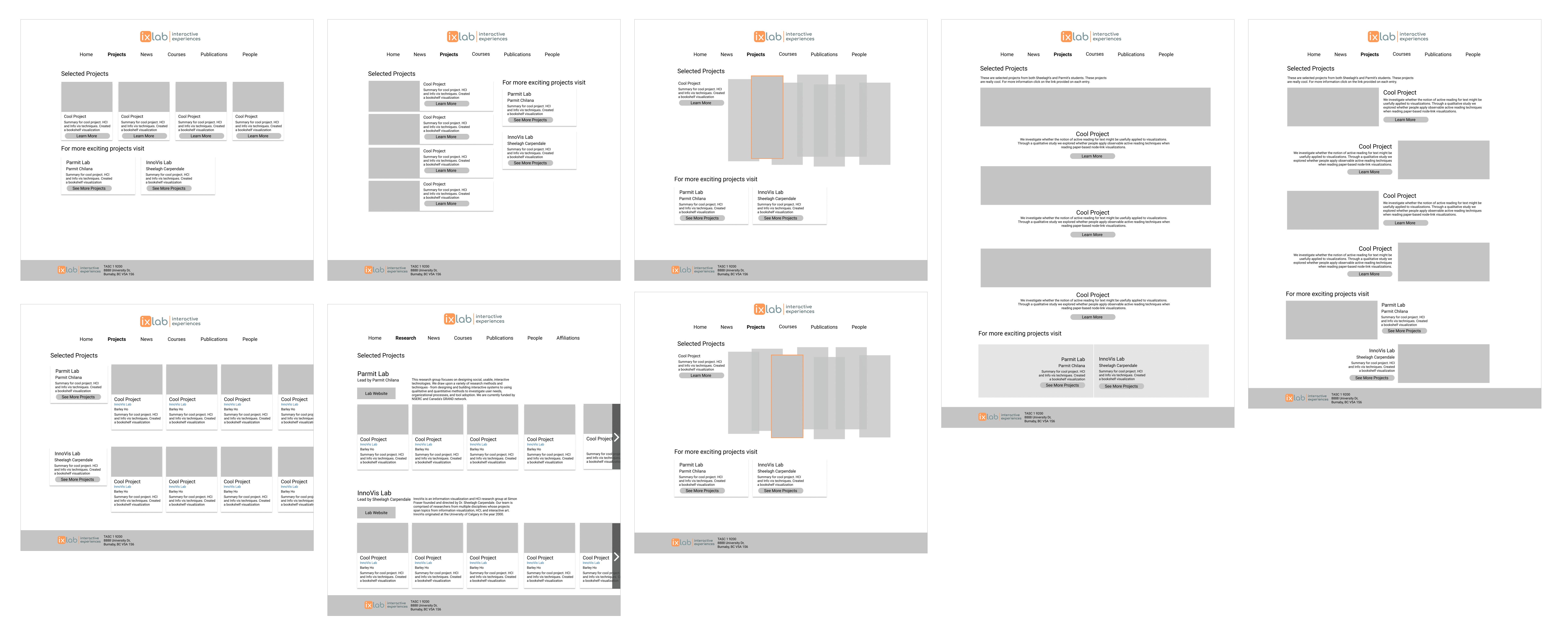
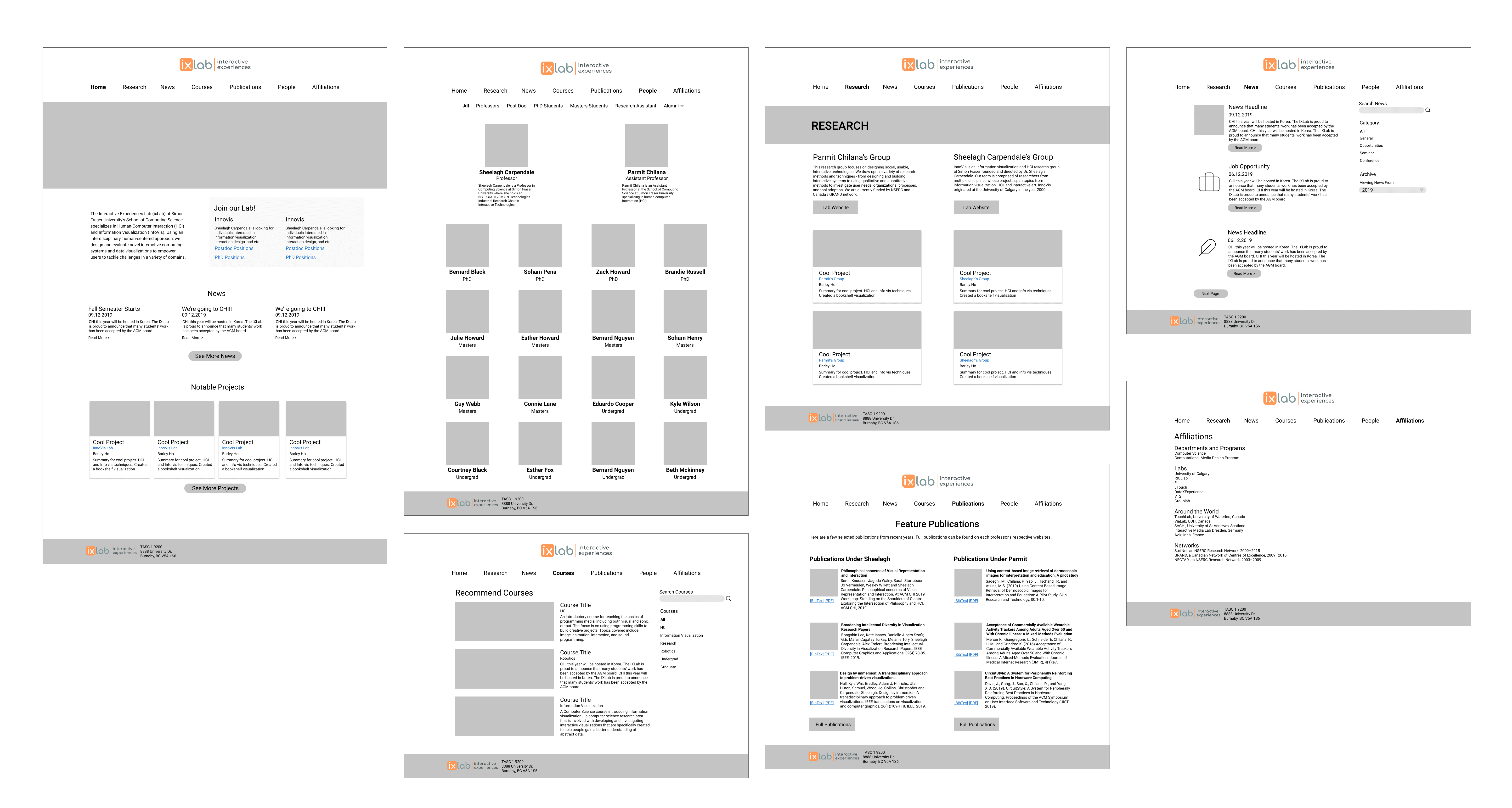
Wireframes
Multiple wireframes were built for each page and presented for feedback. We explored a range of ideas from conservative solutions to out of the box concepts. In the end, we decided to go with more simple designs to reduce complexity.
Branding
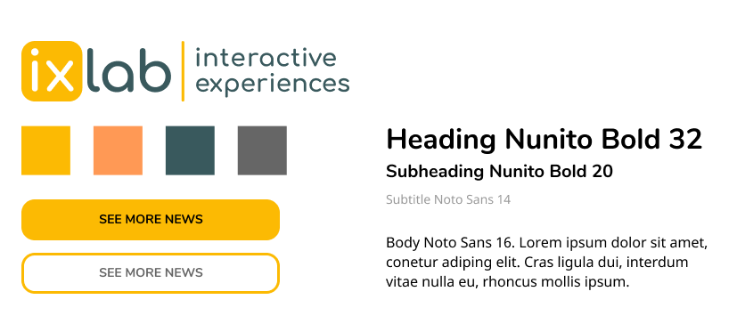
Keywords used to describe the desired mood included: engaging, inviting, simple, clean. From this, we focused on a minimal UI theme that did not get in the way of the content.
We took the existing logo and made minor adjustments to it. The colour palette and typography were also designed with this logo in mind. The rounded Nunito makes the site feel more inviting, and the sans-serif Noto Sans body font is clean and readable to present the meaningful research being conducted.
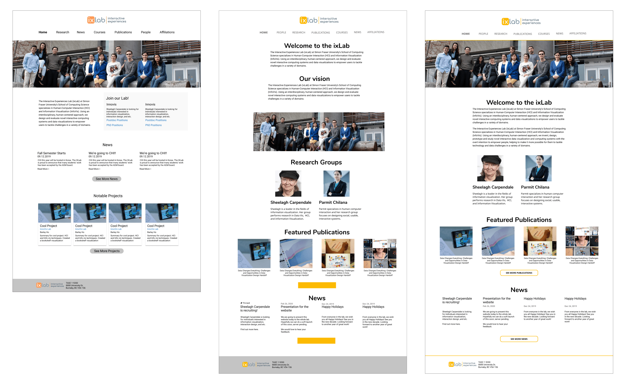
Mockup Iterations
Some pages like the Home page went through multiple rounds of iterations and feedback until we arrived at something that fulfilled the goals of the website.
As we started development, some of the requirements changed and we had to go back to the design. In one instance, we wanted the recruitment ad to be very prominent as a CTA originally. But after presenting a prototype of that, we were given feedback that it was too "in your face" and it evolved to a pinned news item instead.
Insights
Design is never a straight path from mockups to development. We had to go back and modify the design many times even as we were coding the website. Keeping the technical aspects such as how the CSS grid system is structured made new changes more actionable.
DEVELOPMENT
Fullstack dev and deploy
Picking the right platform
Before we finalized the details of the UI, we needed to ensure our platform of choice supported the customizations we wanted. Based on client requirements, we knew it had to be built on a CMS platform where content could be easily managed outside of code.
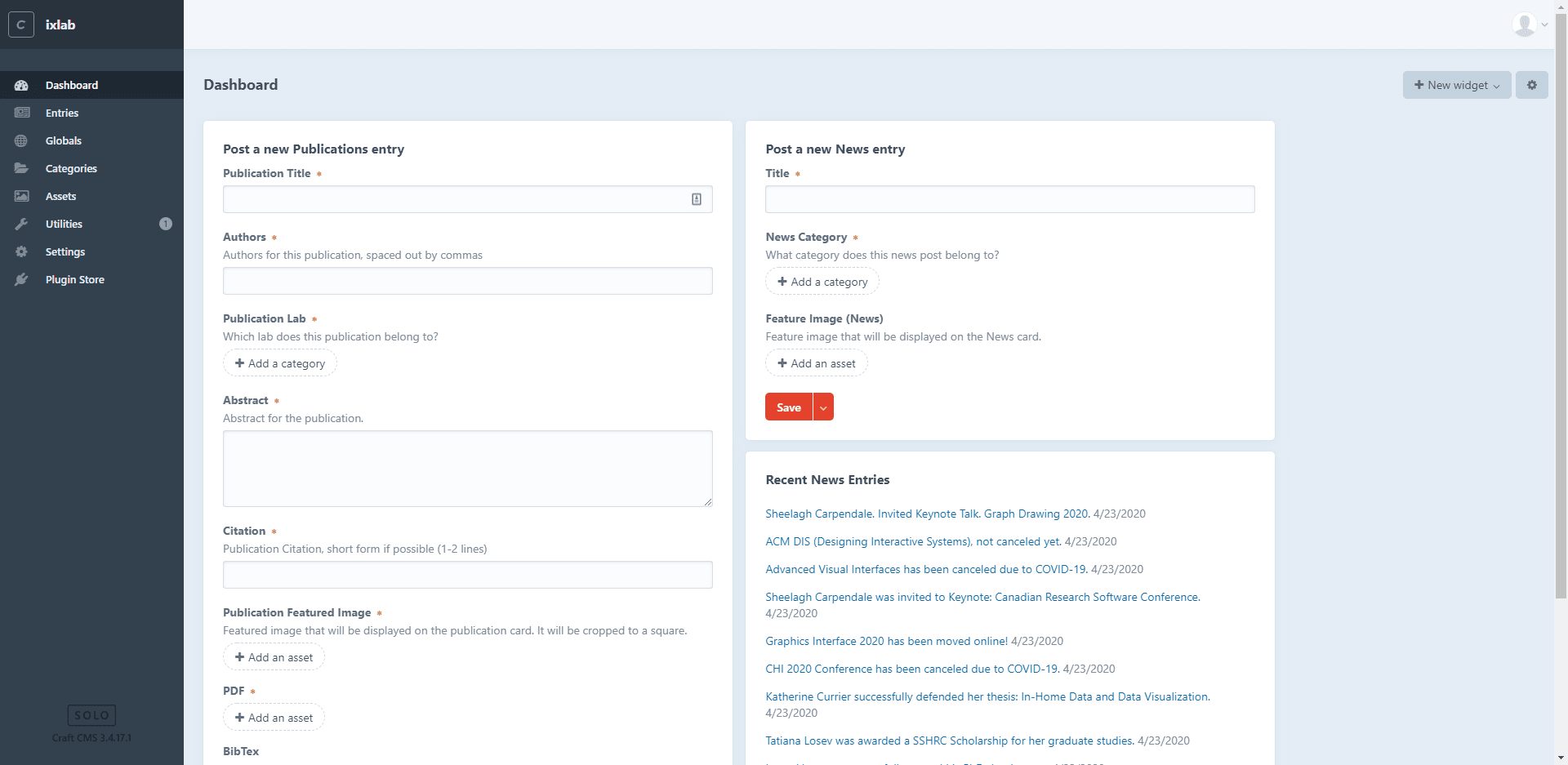
Various platforms such as Wordpress, Drupal, and Kirby were considered, but ultimately we decided to go with Craft CMS. We were impressed by the demo, and the pricing model fit with what we needed. It let us build the site exactly how we wanted, and the powerful admin panel allowed for intuitive content management.
Craft offered a much more guided content management experience than Wordpress. The content was very structured and we used that to model Craft's template system. For example, all publication entries must have a title, author(s), citation, abstract, etc. These fields were put together into a template form so anyone can add content just by filling in the data as shown below.
This platform was quite easy for 2 designers to pick up, meaning that anyone else with basic HTML/CSS knowledge can also learn it quickly.
SOLUTION
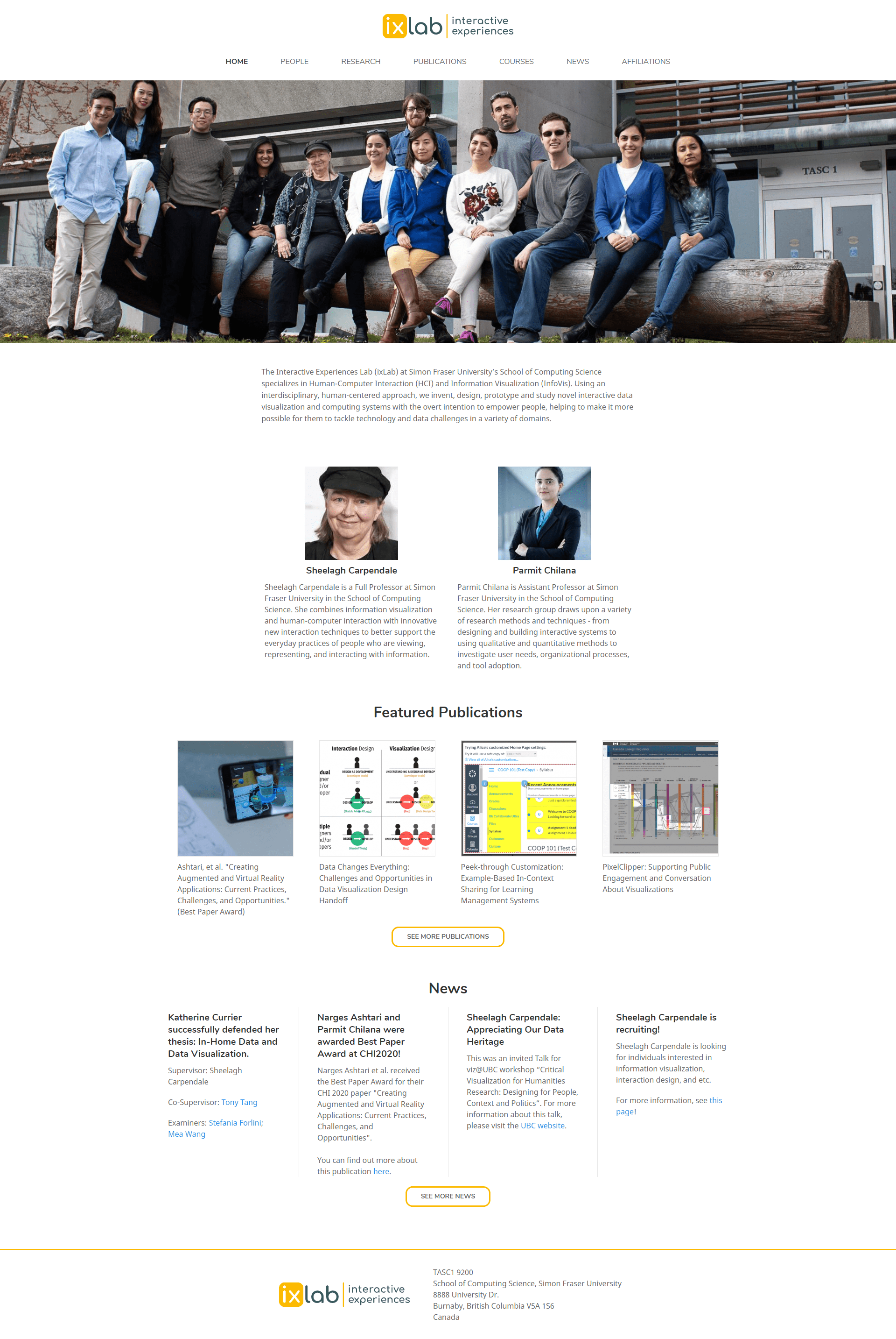
The ixLab website
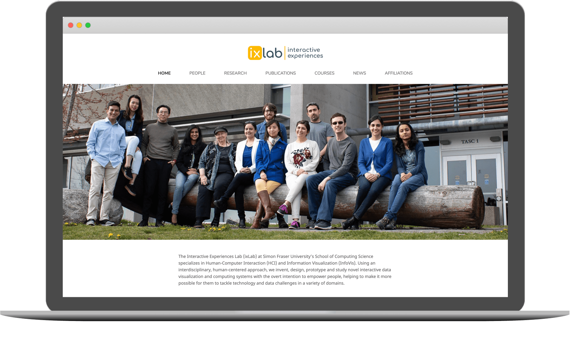
The final solution is a clean, minimal website that showcases the research of the lab and highlights their achievements. On the backend, the admin panel allows the lab to easily update the website with new content through an intuitive interface. The website can be found here at https://ixlab.cs.sfu.ca.
In Retrospect
Key Takeaways and Reflections
Making decisions with (or without) clients
An important soft skill I practiced was effective decision making while working with clients. While they had a strong say in the direction of the design, there were often times where I had to make notable decisions on my own. Waiting on feedback for every decision is not an ideal workflow, especially with busy clients. As long as we stay flexible and patient, designs can be updated as clients change their mind or project requirements update.
Another important realization was that the client is not the user. While the client has their own desires, they are ultimately not the people who will be viewing the website. It is our job as the designer to balance the client's business needs and desires with a delightful experience for the people viewing the site.
Empathy in communication
A certain situation taught me how important it is to apply empathy and understanding when communicating in the workplace.
It was in the midst of the COVID pandemic and we had to request IT to remotely deploy the server for us. Unfortunately, they had their hands tied with more urgent tasks and our request was left on silence for weeks. Our ticket was not a priority for them, and we were stuck at a standstill.
However, I knew the difficult position they were in and used empathy to understand their perspective. By sending emails that described our situation with patience yet persistence, we were eventually able to get what we needed. A key step to effective workplace communication is respecting that others may have different priorities than us and learning to work around it.
I actually like coding again
While I had some prior web development experience, I had to pick up a plethora of new technical skills throughout this project. From Git workflows to understanding web stacks, I tried to follow *proper* web dev practices even though it would have been easy to just slap things together. Although it was quite challenging at times, the best way to learn is through a real project and I rediscovered my passion for development thanks to this.
While my current focus is in design, having these programming skills in my back pocket will let me bring extra value to any team I join. The world of web dev is constantly changing and I'll need to stay up to date to make sure they are relevant for whatever projects come my way next.
next project